
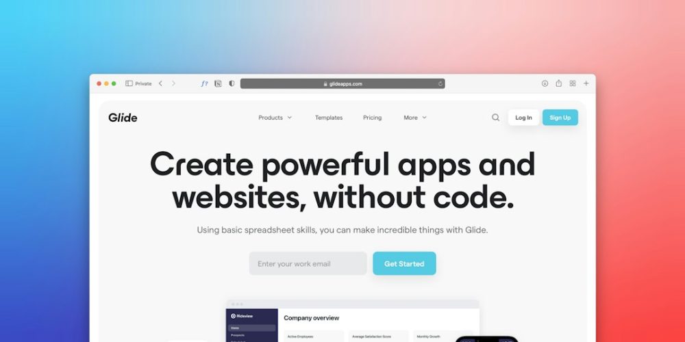
Understanding the Core Purpose of Your Landing Page
You’ve got a fantastic business idea, a brilliant product, or a service that will revolutionize lives. But how do you introduce it to the world in a way that truly resonates and compels action? The answer, my friend, often lies in a well-crafted business landing page. This isn’t just any page on your website; it’s a dedicated, standalone web page created for a specific marketing or advertising campaign. It’s where a visitor “lands” after clicking on an email link, a search engine result, or an advertisement. Its sole purpose is conversion – turning a curious click into a valuable customer action, whether that’s making a purchase, signing up for a newsletter, downloading an ebook, or requesting a demo.
Think of your landing page as your most effective salesperson, always on duty, tirelessly explaining the benefits of your offering, and guiding prospects towards a decision. Unlike your homepage, which might offer a broad overview of your entire business, a landing page is hyper-focused on one particular goal. This singular focus is what makes it so powerful for conversion. You’re eliminating distractions, streamlining the message, and directing the visitor’s attention precisely where you want it. Understanding this fundamental distinction is the first step towards building a landing page that doesn’t just look good, but actively drives your business forward. Without a clear objective, your landing page will simply be another page on the internet, lost in the noise. You need to define what success looks like for this specific page before you even start thinking about design or copy. Is it lead generation? Sales? Event registration? Your answer will shape every element you include.
Defining Your Conversion Goal
Before you write a single word or pick a single image, you must define your primary conversion goal. What exactly do you want your visitors to do when they land on this page? Without a clear objective, your page will lack direction and fail to convert effectively. Is your goal to collect email addresses for future marketing? To sell a specific product? To encourage sign-ups for a webinar? Or perhaps to get users to download a free guide? Each of these goals requires a slightly different approach in terms of content, calls to action, and even visual design. For instance, a page designed to capture leads might offer a compelling free resource in exchange for an email, while a sales page will focus more on product benefits, testimonials, and a direct purchase button. Be specific and measurable. Instead of “get more customers,” think “increase email sign-ups by 15% this quarter” or “achieve 50 product sales by month-end.” This specificity will help you track your success and refine your page over time.
Identifying Your Target Audience
Who are you trying to reach with this landing page? Understanding your target audience is paramount. You can’t speak to everyone, and trying to do so will dilute your message. Create buyer personas: detailed profiles of your ideal customers. Consider their demographics (age, gender, location, income), psychographics (interests, values, pain points, motivations), and behavior (how they search for solutions, what kind of language resonates with them). What problems are they trying to solve? How does your product or service provide that solution? What objections might they have? Knowing your audience intimately allows you to tailor your language, visuals, and overall message to directly address their needs and desires. This personalization makes your landing page feel relevant and increases the likelihood of conversion. When you speak directly to someone’s specific needs, they are far more likely to listen and respond.
Creating an effective business landing page is crucial for converting visitors into customers, but it’s also important to ensure that your website is secure. For insights on how to protect your landing page and overall website, you can check out this related article on the latest website security best practices: 12 Latest Website Security Best Practices in 2023. Implementing these security measures can help build trust with your visitors, ultimately leading to higher conversion rates.
Crafting Compelling Copy That Resonates
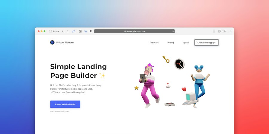
Once you understand your goal and your audience, the real work begins: crafting the words that will persuade your visitors. Your landing page copy is not just about describing your product; it’s about selling a solution, evoking emotion, and building trust. Every word you choose should be deliberate, concise, and focused on driving the visitor towards your conversion goal. Think of yourself as a guide, leading your audience step-by-step through the journey of understanding how your offering can benefit them, overcoming their potential hesitations, and ultimately convincing them to take action. This isn’t the place for jargon or overly technical language unless your audience specifically expects it. Instead, aim for clarity, empathy, and a strong focus on the value you provide.
Your landing page has only a few seconds to capture attention before a visitor decides to bounce. This means your headlines, subheadings, and opening paragraphs need to be incredibly powerful. They need to instantly communicate value and pique curiosity. Beyond the initial hook, your copy must systematically address the visitor’s pain points, present your solution as the ideal remedy, and provide ample social proof to build credibility. Remember, people buy based on emotion and then justify with logic. Your copy needs to tap into both.
The Power of a Strong Headline
Your headline is the most crucial piece of copy on your entire landing page. It’s the first thing visitors see, and it often determines whether they stay or leave. A compelling headline instantly grabs attention, communicates your unique value proposition, and creates curiosity. It should be clear, concise, and benefit-oriented. Don’t just state what your product is; tell your visitor what it will do for them. For example, instead of “Our Project Management Software,” try “Organize Your Projects, Boost Your Team’s Productivity by 30%.” Use strong action verbs and highlight a quantifiable benefit whenever possible. A/B test different headlines to see which ones resonate most with your audience. The best headlines are often the ones that promise a solution to a common problem or offer a desirable outcome.
Emphasizing Benefits Over Features
A common mistake businesses make is focusing too heavily on features rather than benefits. Features are what your product has; benefits are what your customer gets from those features. Customers don’t buy drills because they love drills; they buy drills because they want holes. They don’t care about the technical specifications of your software as much as they care about how it will save them time, reduce stress, or increase their profits. Translate every feature into a tangible benefit for your customer. For instance, if your software has “cloud storage,” the benefit is “access your files anytime, anywhere, on any device.” If your service offers “24/7 customer support,” the benefit is “get immediate help and peace of mind whenever you need it.” Constantly ask yourself, “So what?” after listing a feature. The answer to that question is often the benefit.
Crafting a Clear Call to Action (CTA)
Your Call to Action (CTA) is the moment of truth. It’s the instruction that tells your visitor exactly what you want them to do next. A strong CTA is clear, concise, and creates a sense of urgency or excitement. Avoid vague phrases like “Click Here.” Instead, use action-oriented language that reflects the benefit the user will receive, such as “Get Your Free Ebook Now,” “Start Your 30-Day Trial,” “Claim Your Discount,” or “Book a Demo.” The CTA button should stand out visually through its color, size, and placement. Make it impossible to miss. Furthermore, reassure visitors about what happens after they click – for example, “No Credit Card Required” or “Your Information is Safe With Us.” This reduces friction and anxiety, encouraging them to take the next step.
Designing for Maximum Impact and User Experience

While compelling copy forms the backbone of your landing page, an effective design is its skeleton and skin. The visual elements of your landing page are critical for engaging visitors, guiding their eyes, and reinforcing your message. Good design isn’t just about aesthetics; it’s about functionality, clarity, and user experience. A cluttered, confusing, or visually unappealing page will drive visitors away faster than poor copy. You need a design that is clean, professional, and intuitive, making it easy for visitors to understand your offering and take the desired action. Every design choice, from your color palette to your image selection, should be intentional and serve your overarching conversion goal.
Your design choices communicate professionalism, trustworthiness, and attention to detail. A well-designed page instills confidence in your brand, making visitors more comfortable engaging with your offer. Conversely, a poorly designed page can make your business appear amateurish or unreliable, regardless of the quality of your product or service. Focus on creating a seamless and pleasant experience for your users, ensuring that their journey from arrival to conversion is as smooth and unobstructed as possible.
The Importance of Visual Hierarchy
Visual hierarchy is about arranging elements on your page in a way that guides the visitor’s eye to the most important information first. Use size, color, contrast, and spacing to draw attention to your headline, key benefits, and especially your Call to Action. The most important elements should be the most prominent. For example, your headline should be the largest text, followed by subheadings, and then body copy. Your CTA button should be a contrasting color that pops off the page. Utilize white space effectively to prevent your page from looking cluttered and overwhelming. White space gives your content room to breathe and makes it easier to scan and digest. A clear visual flow ensures that visitors absorb your core message quickly and effortlessly.
Strategic Use of Images and Videos
Images and videos are powerful tools for communicating your message quickly and emotionally. High-quality, relevant visuals can capture attention, illustrate benefits, and build trust more effectively than text alone. Use images that are professional, appealing, and directly related to your offer. If you’re selling a product, show it in action or in a lifestyle context. If you’re selling a service, use images that evoke the positive outcome clients can expect. Explainer videos can be particularly effective for complex products or services, as they can convey a lot of information in a short, engaging format. Ensure your visuals are optimized for fast loading times, as slow pages can frustrate users and lead to bounces. Avoid generic stock photos that don’t truly represent your brand or offering; authenticity resonates much more deeply.
Mobile Responsiveness and Loading Speed
In today’s mobile-first world, your landing page absolutely must be mobile-responsive. This means it should automatically adjust and look great on any device, from desktops to tablets to smartphones. A poor mobile experience will alienate a significant portion of your audience and severely impact your conversion rates. Test your page rigorously on various devices and browsers to ensure seamless functionality. Equally crucial is loading speed. Visitors are impatient. If your page takes more than a few seconds to load, many will abandon it before they even see your offer. Optimize your images, minify your code, and leverage browser caching to ensure your page loads as quickly as possible. Tools like Google PageSpeed Insights can help you identify and fix performance bottlenecks.
Building Trust and Credibility with Social Proof
Even the most compelling copy and stunning design won’t convert if visitors don’t trust you. In an online world rife with skepticism, building credibility is paramount. Social proof is a psychological phenomenon where people assume the actions of others in an attempt to reflect correct behavior for a given situation. On your landing page, this translates to showing potential customers that others have already tried, trusted, and benefited from your product or service. It’s about demonstrating that you’re not just making claims, but that those claims are validated by real people and reputable sources.
Think of it this way: you’re more likely to try a new restaurant if you see it’s bustling with happy customers and has excellent online reviews. The same principle applies to your landing page. By strategically incorporating elements that showcase the positive experiences of others, you can significantly reduce perceived risk and build the confidence necessary for a visitor to convert. Without social proof, your assertions about your offering, no matter how true, can feel like empty promises.
Customer Testimonials and Reviews
One of the most powerful forms of social proof is authentic customer testimonials and reviews. Feature quotes from satisfied customers that speak directly to the benefits they experienced and the problems your product or service solved for them. Don’t just pick generic praise; choose testimonials that are specific, enthusiastic, and ideally, include the customer’s name, photo, and perhaps their company or title. Video testimonials are even more impactful as they add an extra layer of authenticity. If you have a platform for customer reviews (like Google My Business, Yelp, or industry-specific sites), consider embedding snippets or links to those reviews. The more genuine and detailed your testimonials, the more credible they will appear to new visitors.
Trust Badges and Security Seals
Displaying trust badges and security seals can significantly alleviate concerns about online security and privacy, especially if your landing page involves collecting personal information or processing payments. Logos from well-known security providers (like Norton Secured, McAfee Secure, or Trustpilot) instantly signal that your site is safe. If you offer payment processing, display logos of accepted payment methods (Visa, Mastercard, PayPal) to reassure users about the transaction process. Beyond security, consider badges that highlight awards, industry certifications, or affiliations with reputable organizations. These types of badges act as third-party endorsements, signaling that your business is legitimate and adheres to certain standards.
Showcase Case Studies and Success Stories
For more complex products or services, or for business-to-business (B2B) landing pages, detailed case studies and success stories can be incredibly effective. These go beyond simple testimonials by providing a narrative of how a specific client faced a challenge, used your solution, and achieved measurable positive results. Include data, graphs, and direct quotes to make these stories as compelling and believable as possible. While you might not put full case studies directly on the landing page (unless it’s a very long-form page), you can feature compelling summaries or impactful results and offer a downloadable PDF of the full study. This demonstrates a proven track record and offers concrete evidence of your value proposition.
Creating an effective business landing page is crucial for converting visitors into customers, and understanding the importance of reliable hosting can significantly enhance your website’s performance. For those looking to optimize their online presence, exploring how dedicated hosting can provide the necessary speed and security is essential. You can learn more about this in the article on why dedicated hosting is the perfect solution for your website. By ensuring your landing page is backed by robust hosting, you can improve user experience and increase conversion rates.
Optimizing for Continuous Improvement
| Metric | Description | Recommended Value/Goal | Importance |
|---|---|---|---|
| Conversion Rate | Percentage of visitors who complete the desired action (e.g., sign up, purchase) | 5% or higher | High |
| Page Load Time | Time taken for the landing page to fully load | Under 3 seconds | High |
| Bounce Rate | Percentage of visitors who leave without interacting | Less than 40% | High |
| Call-to-Action (CTA) Click-Through Rate | Percentage of visitors who click on the CTA button | 20% or higher | High |
| Average Time on Page | Average duration visitors spend on the landing page | At least 1 minute | Medium |
| Mobile Responsiveness Score | How well the landing page performs on mobile devices | 90% or higher (Google Mobile-Friendly Test) | High |
| Form Completion Rate | Percentage of visitors who complete and submit forms | 30% or higher | High |
| Trust Signals Presence | Inclusion of testimonials, reviews, or certifications | At least 3 trust signals | Medium |
| Headline Clarity Score | How clearly the headline communicates the value proposition | Score of 8/10 or higher (via user testing) | High |
| Visual Appeal Rating | User rating of the landing page design and layout | 7/10 or higher | Medium |
Your landing page isn’t a “set it and forget it” asset. The digital landscape is constantly evolving, and so are your customers’ needs and behaviors. To truly create a landing page that converts visitors into customers consistently, you must embrace a philosophy of continuous improvement. This means actively monitoring its performance, gathering data, and making iterative changes based on insights. Without optimization, even the best initial design and copy will eventually lose their effectiveness, or worse, never reach their full potential.
Optimization is an ongoing process of testing, learning, and refining. It’s about understanding what’s working, what’s not, and why. By systematically approaching improvements, you can incrementally boost your conversion rates, get more value from your marketing spend, and ultimately drive greater business success. Don’t assume your first iteration is perfect; assume there’s always room to do better. This commitment to improvement is what separates a good landing page from a truly exceptional one that consistently delivers results.
A/B Testing Key Elements
A/B testing (also known as split testing) is a fundamental part of landing page optimization. It involves creating two versions of a page (A and B) with only one element changed between them (e.g., headline, CTA button color, image, form field placement). You then split your traffic, sending half to version A and half to version B, to see which version performs better against your conversion goal. This allows you to make data-driven decisions rather than relying on guesswork. Test one element at a time to isolate the impact of each change. Common elements to A/B test include:
- Headlines: Different value propositions or emotional appeals.
- Call to Action: Wording, color, size, placement.
- Images/Videos: Different visuals, explainer video vs. static image.
- Form Length: More fields vs. fewer fields.
- Body Copy: Different benefit emphasis, length.
- Page Layout: Section ordering, amount of white space.
Always have a clear hypothesis for why you expect one version to outperform the other.
Analyzing Performance Metrics
To know if your landing page is performing well, you need to track key metrics. Use tools like Google Analytics to monitor traffic sources, bounce rate, time on page, and conversion rate.
- Conversion Rate: This is the most critical metric. It tells you the percentage of visitors who complete your desired action. Calculate it by dividing the number of conversions by the total number of visitors and multiplying by 100.
- Bounce Rate: The percentage of visitors who leave your page after viewing only one page. A high bounce rate could indicate that your page isn’t relevant to what they expected, loads slowly, or isn’t engaging.
- Time on Page: How long visitors spend on your landing page. A longer time generally indicates more engagement, especially if it leads to conversion.
- Traffic Sources: Understanding where your visitors are coming from (e.g., organic search, paid ads, social media, email) can help you optimize your promotional efforts.
Regularly review these metrics to identify trends and areas for improvement. Don’t just look at the numbers; try to understand the story behind them.
Iterative Refinement Based on Data
The data you collect from A/B tests and performance metrics should inform your iterative refinement process. Don’t be afraid to make changes. If an A/B test shows that a different headline significantly increases conversions, implement that headline permanently. If your bounce rate is high, investigate why – is the messaging unclear? Is the page loading slowly? Is it not meeting user expectations from the ad they clicked?
Optimization is not about making one grand change; it’s about a series of small, incremental improvements that add up over time. Every test, every data point, provides a piece of the puzzle, helping you understand your audience better and create a more effective landing page. Maintain a log of all changes you make and their corresponding results to build a knowledge base of what works for your specific audience and offering. This systematic approach to refinement ensures your landing page continuously evolves to meet new challenges and maximize its conversion potential.
FAQs
What is a business landing page?
A business landing page is a standalone web page designed specifically for marketing or advertising campaigns. Its primary goal is to convert visitors into leads or customers by encouraging them to take a specific action, such as signing up for a newsletter, making a purchase, or filling out a contact form.
What elements should be included on a landing page to improve conversion rates?
To improve conversion rates, a landing page should include several key elements: a compelling headline, a clear and concise value proposition, engaging visuals, a strong call-to-action (CTA), testimonials or social proof, and a simple form for capturing visitor information. Additionally, ensuring the page is mobile-friendly and loads quickly can also enhance user experience and conversions.
How can I optimize my landing page for search engines?
To optimize your landing page for search engines, focus on using relevant keywords in the page title, headings, and throughout the content. Additionally, include meta descriptions, alt text for images, and ensure the URL structure is clean and descriptive. Building backlinks and improving page load speed can also contribute to better search engine rankings.
What is A/B testing and how can it be applied to landing pages?
A/B testing, or split testing, involves creating two or more variations of a landing page to determine which one performs better in terms of conversion rates. By changing elements such as headlines, images, or CTAs, businesses can analyze user behavior and preferences, allowing them to make data-driven decisions to optimize their landing pages for better performance.
How can I track the performance of my landing page?
You can track the performance of your landing page using web analytics tools like Google Analytics. These tools provide insights into metrics such as page views, bounce rates, conversion rates, and user behavior. Additionally, using tracking pixels or UTM parameters can help you measure the effectiveness of specific marketing campaigns driving traffic to your landing page.







Add comment